
Trick to Streamline Charts in Qualtrics
I recently had a problem with customizing charts in Qualtrics' reports feature. The charts were based on a question which had several categories for the respondents to rank. To simplify the report, I wanted to create several charts which show one category each, but the options to turn off some of the categories were outside of the viewable area. Luckily, there is an easy, and not so obvious, way to view those hidden options.
Background
The chart I needed to create was for a Matrix Table question. But the chart was a bit cramped due to there being eight different categories for participants to rank (see Figure 1).
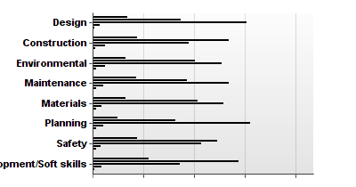
Figure 1. Initial Chart
I tried removing all but one category by clicking Graph Options, clicking Show/Hide Columns, and unchecking the undesired categories (see Figure 2).
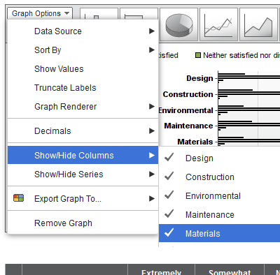
Figure 2. Removing Categories
But some of the categories are cut off. I tried using the scroll wheel on my mouse to access them, different browsers, etc., but nothing seemed to work.
Solution
Accessing the options is as simple as resizing the chart. You just need to grab the resize handle in the lower right corner of the chart (see Figure 3) and drag it.

Figure 3. Chart's Resize Handle
When the chart is large enough, all of the categories will be visible (see Figure 4).
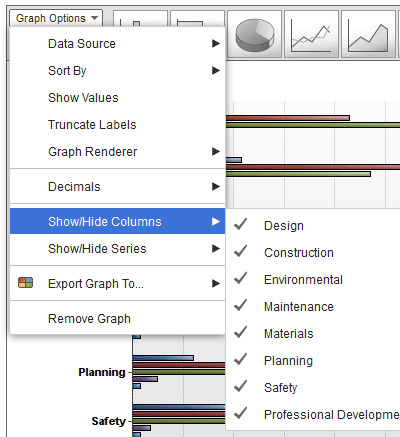
Figure 4. Showing All Categories
0 Comments
There are currently no comments.
Leave a Comment