
Trick Google Chrome Browser Window to Be Narrower Than 500 Pixels for Testing Responsive Designs
An issue I'm running into is that Google Chrome prevents its browser window from being narrower than 500 pixels. So I was using browsers, like Internet Explorer, to see how website designs adjust for small-screen devices. The problem is that I'm most familiar with the development tools available through Chrome. And there are times where it's easier to tweak the HTML and CSS code directly in Chrome versus going back to my normal code editor, editing the code, uploading the modified script, and then testing the changes. It turns out that there are a couple of options for addressing the issue.
Background
I primarily use Chrome when testing new design ideas since that's what the analytics says most people use when visiting the websites I manage. Of course, I'll check the designs in other popular browsers like Internet Explorer and Firefox. However, most of my time is spent with Chrome.
Note that the directions and screenshots in this post are based on Chrome version 74.0.3729 for Windows 10. Also note that I customized the background colors of my DevTools window. Your DevTools window will likely look different.
Chrome Mobile Viewer
The first option is to use Chrome's built-in feature for testing websites for small-screen devices called Device Mode. The option provides a few ways to quickly adjust the browser window to the desired dimensions. There's even a drop-down menu for selecting popular devices (e.g., iPhone X) that your visitors might use when viewing your website. Selecting a device automatically resizes the window to simulate what the page would look like.
You just need to visit the web page you want to test and open Chrome's DevTools. This can be accomplished by right clicking anywhere on your page and clicking Inspect Element…or you could use the following steps:
- Click the three dots near the top right of your browser window (see Figure 1)
- Hover over More tools
- Click Developer tools (see Figure 2)
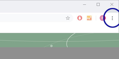
Figure 1. Click browser window's three-dots icon
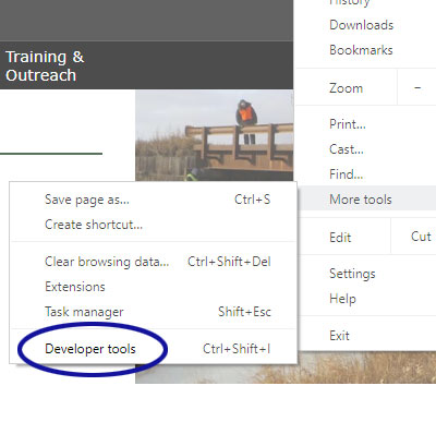
Figure 2. Click the "Developer tools" option
From the DevTools window, click the "Toggle device toolbar" icon (see Figure 3).
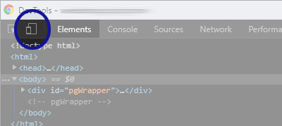
Figure 3. Toggle the device toolbar on
Going back to the browser window, the website should now be formatted using the browser dimensions indicated in the device toolbar (see Figure 4).
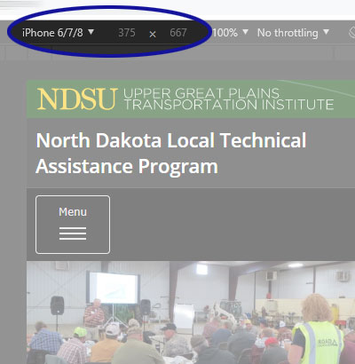
Figure 4. Set browser's dimensions using the device toolbar
One disadvantage of Device Mode is that it isn't always obvious when a design stretches beyond the vertical space available. The design may seem perfectly fine until you start scrolling. If the page bounces left and right as you scroll, the design is too wide. It would be nice if there was an obvious indicator when a design is too wide.
Alternative Method
As mentioned earlier, Chrome prevents browser windows from being narrower than 500 pixels. When I'm making a number of successive changes and I want to guarantee that I'll catch whether the changes lead to the design being too wide, I'll use the DevTools window to trick the browser into showing narrower widths.
First, you'll need to make sure Device Mode is no longer active. Deactivating Device Mode is accomplished by clicking the "Toggle device toolbar" icon, shown in Figure 3 above, again. Your page should display how it normally appears in the browser window and the device toolbar should be hidden.
If Chrome's DevTools window isn't already open, open it using the steps described in the previous section (above). The goal is to dock the DevTools window to the side of the browser window. This can be accomplished by
- Clicking the three dots on the DevTools window
- Note: make sure to use the dots on the DevTools window, not the ones on the browser window near the address bar.
- Clicking the icon that docks the DevTools window to the right (or left) side of the browser window (see Figure 5)
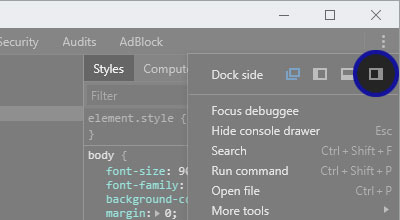
Figure 5. Dock DevTools window to the side of the browser
Now you can expand or contract the DevTools window to change how wide your web page appears in the browser. That can be accomplished by grabbing the side of the DevTools window that's adjacent to the web page and dragging the window to the left or right (see Figure 6).

Figure 6. Expand DevTools window to make browser window smaller
With this trick, the web page can be viewed all the way down to 150 pixels wide. If the page's design is too wide, the vertical scroll bar will appear.
0 Comments
There are currently no comments.
Leave a Comment