Entries tagged "responsive design"
Trick Google Chrome Browser Window to Be Narrower Than 500 Pixels for Testing Responsive Designs

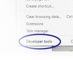
An issue I'm running into is that Google Chrome prevents its browser window from being narrower than 500 pixels. So I was using browsers, like Internet Explorer, to see how website designs adjust for small-screen devices. The problem is that I'm most familiar with the development tools available through Chrome. And there are times where it's easier to tweak the HTML and CSS code directly in Chrome versus going back to my normal code editor, editing the code, uploading the modified script, and then testing the changes. It turns out that there are a couple of options for addressing the issue. [Continue reading]
Lessons Learned: Live2Lead Website and Using Qualtrics for Collecting Event Registrations

For the new websites I create, my goal has been to make them responsive. That way I get some practice before committing to an overhaul of a major website. The extra practice should make the redesign process go smoother since hopefully I'll have the experience to solve whatever problems I come across. With the latest website, I was given the opportunity to further enhance my skills. Plus, I found a new, and somewhat unusual, solution for collecting event registrations. [Continue reading]
Lessons Learned: Responsive Design and the SU4T Website

I was asked to develop a website for a one-day event. The project proved to be an excellent opportunity to sharpen my responsive design skills. Now, I have completed projects here and there where website content was adjusted on the fly to fit different browser window sizes, but I haven't spent much time making an entire website responsive. [Continue reading]

