
Are Your Google Services Too Difficult to Find in the Recent Redesign
As website developers, we should look for ways to make using our websites more intuitive for visitors. They should be able to use our websites without needing to think about how to accomplish what they want to do. For example, if you use services like Google Docs, Google Analytics, Google Calendar, etc., you've probably noticed that Google redesigned the navigation bar across the top of https://www.google.com/. The problem is that the link which shows all the services you're signed up for is a little difficult to find.
To use one of Google's services, I usually visit their home page and click my account settings link. But that link was moved with the recent update. My first thought was to click my name that has the down arrow icon, which usually suggests a drop-down menu. But there is only an option to sign out (see Figure 1).
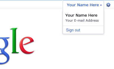
Figure 1. Google Sign Out Link
Of course, it didn't take long to figure out that I was supposed to click the gear icon next to my name for the account settings link (see Figure 2).
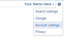
Figure 2. Google Account Settings Link
So, is there a reason they need two drop-down menus? Maybe they plan to add more options in the near future or maybe there are options not shown because I don't use Gmail, for example. But with the way things are now, Google could have easily merged the two drop-down menus. For bonus points, I would love to see them change the link to something like "My Google Services" instead of account settings.
0 Comments
There are currently no comments.
Leave a Comment