
Lessons Learned: Responsive Design and the SU4T Website
I was asked to develop a website for a one-day event. The project proved to be an excellent opportunity to sharpen my responsive design skills. Now, I have completed projects here and there where website content was adjusted on the fly to fit different browser window sizes, but I haven't spent much time making an entire website responsive.
Background
My goal for this project was to design a website that closely matched the printed poster (see Figure 1). The website also needed to be mobile friendly since a major focus of the event involved a selfie contest and the posters encouraged participants to view the website.
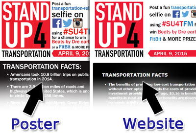
Figure 1. Event Poster and Website Design
The most challenging part of the project was making the website responsive (see Figure 2). Well, the challenge actual came from my lack of experience with responsive design. I've experimented with making aspects of a website responsive, but I've done very little with building a complete design, especially a design that works with mobile devices.
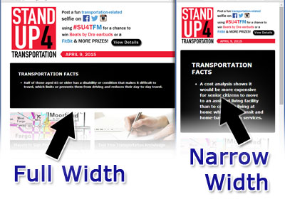
Figure 2. Design in a Wide and Narrow Browser Window
Overview of Website Features
In addition to the standard website content, such as the event description, dates, etc., the event organizers wanted to incorporate some fun things into the website. Since the event's purpose was to increase awareness of the transportation issues we currently face, we decided to display a series of transportation facts.
The event organizers put together dozens of facts that were added to a MySQL database. I then developed a script to pull all the facts, randomize them, and then display one fact at a time.
Several of the facts were also used in a quiz feature that I developed for the website. The quiz was set to display a single question with a series of possible answers. After the visitor selects their response, the script let them know if they got the correct answer and further explained the fact (see Figure 3).
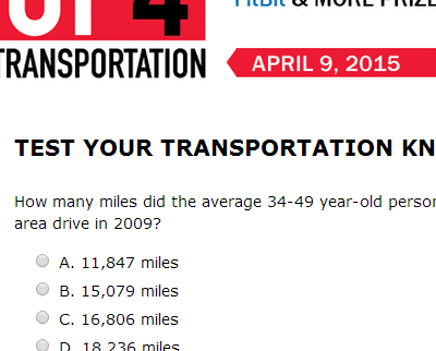
Figure 3. Website's Quiz Feature
Lessons Learned
To monitor the selfie contest, I planned to use the built-in feature for following hashtags in Twitter, Facebook, and Instagram. But one of the event organizers mentioned that you can follow all three social networks with a service called Hootsuite. All you need to do is
- Log into Hootsuite (note that free accounts are available)
- Enter the hashtag you want to follow and press enter (see Figure 4)
- Select the social network you want to follow (see Figure 5)
- Click Save as Stream (see Figure 6)
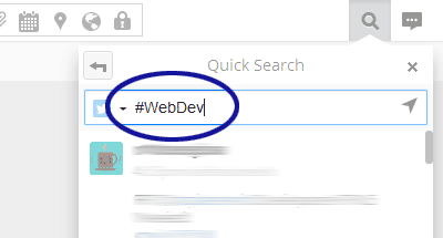
Figure 4. Search for a Hashtag
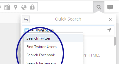
Figure 5. Select a Social Network
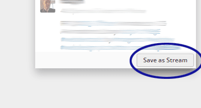
Figure 6. Click Save as Stream
Note that Hootsuite uses your social network accounts to perform the various searches. So if you want to follow a hashtag on Facebook, for example, you'll need to be logged into Facebook through Hootsuite.
0 Comments
There are currently no comments.
Leave a Comment